Design System Update
Sumsub, 2023 – 2024
About the project
Sumsub Mobile SDK, or Software Development Kit, is a tool that lets clients add KYC verification to their iOS and Android apps.
The problems
The design system had been created a long time ago and was no longer maintained by the design team. Developers had made UI changes that were never added to the design system. As a result, the designs and the live product no longer matched.
There was no shared naming system across design and code. This made communication with developers harder.
The color palette was outdated and did not match the main product's color system. It also could not support theme customization. I can share more details in person.
Goals
1
Update the tokens
- Align the base colors with the WebSDK design system. WebSDK is a separate tool that brings the KYC verification interface into a web product.
- Add the missing semantic tokens for colors, sizes, and type.
2
Improve token naming
3
Review component accessibility
- Color contrast
- Type scale
- VoiceOver checking
4
Update the icon set
A new color system

The WebSDK project already had a set of base colors. We reused part of it and adapted the colors to the needs of Mobile SDK.
One of the main challenges was the amount of manual component testing. New shades, transparency, and other changes meant that every component had to be linked to the new colors again.
Together with the developers, we created test builds of the SDK using the new variables. We tested them across every available screen and state. This helped us catch weak spots in the live product.
Together with the developers, we created test builds of the SDK using the new variables. We tested them across every available screen and state. This helped us catch weak spots in the live product.
The outcome
- We created a stable and scalable color system.
- We made the Mobile SDK and WebSDK color palettes consistent.
- We created a stable and scalable color system.
- We made the Mobile SDK and WebSDK color palettes consistent.
Naming system
.webp)
Poor communication between design and development had led to different names for the same components and tokens. This regularly caused confusion and mistakes.
To fix the issue quickly without adding more complexity, we adopted the naming used in the Mobile SDK technical documentation. Developers already understood it, and it worked just as well for the design team.
The outcome
- We introduced one shared naming system. A couple of messages are now enough to understand what someone means, with no need to explain everything through screenshots.
- In the future, this can support automatic JSON exports from Figma into code.
To fix the issue quickly without adding more complexity, we adopted the naming used in the Mobile SDK technical documentation. Developers already understood it, and it worked just as well for the design team.
The outcome
- We introduced one shared naming system. A couple of messages are now enough to understand what someone means, with no need to explain everything through screenshots.
- In the future, this can support automatic JSON exports from Figma into code.
Accessibility review

We tested color contrast using WCAG and APCA methods and found a small number of issues. I created a clear reference chart with values and recommendations.

I also prepared recommendations for updating the text styles. These changes are easy to implement and do not require redesigning or rebuilding the screens. They will help the product meet WCAG guidelines and become more accessible.

For the VoiceOver review, I went through the main screens with the screen reader enabled and checked how it announced each component. I then documented the issues and suggested improvements.
The outcome
- Unfortunately, we only had time to review some of the screens and components. Still, this work created a solid starting point for future accessibility improvements.
- Unfortunately, we only had time to review some of the screens and components. Still, this work created a solid starting point for future accessibility improvements.
New icons
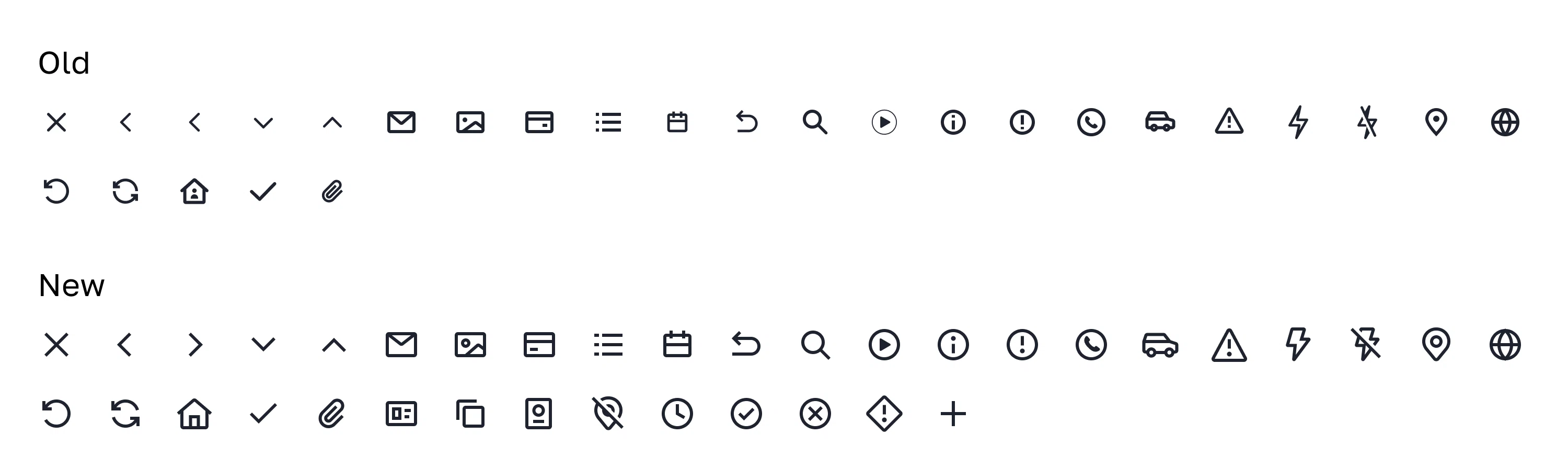
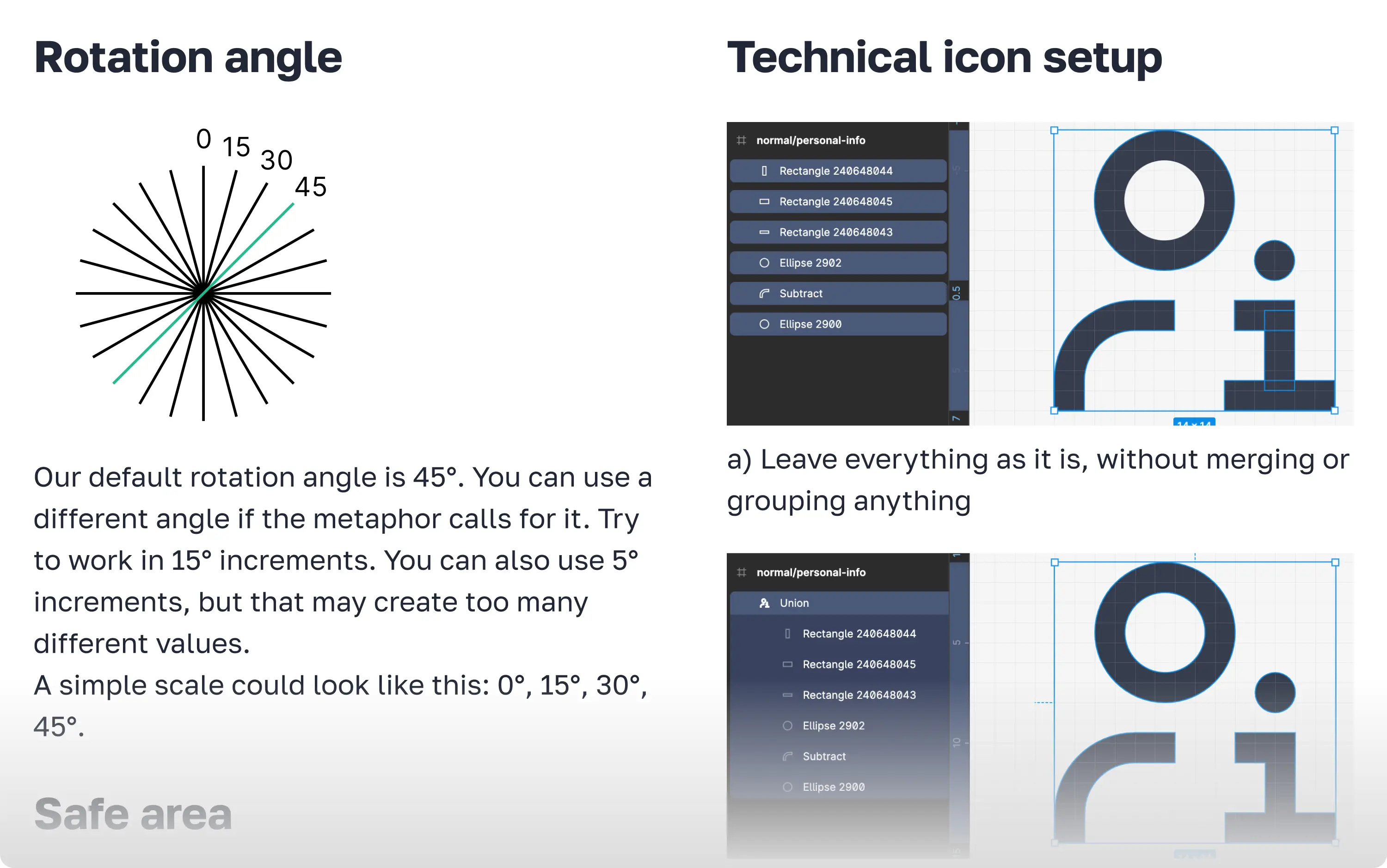
Finally, I redesigned a small icon set. We made the icons easier to read in the interface and gave them a more consistent style. I also created an icon design guide covering both visual principles and technical recommendations.
P.S.
Along the way, we added missing components, improved existing ones, and wrote technical documentation.